

Anywhere, anytime

A currency converting travel app / responsive website

The Project
March 2024 - May 2024
Design an app and a responsive website to help global travelers find the current exchange rates between two currencies.
"
"

Problem
Users are unable to quickly find accurate exchange rates between currencies, convert their budgets into local currencies or track group spending accurately.
Goal
To design an easy to use and app and website that users can use to quickly find up to date exchange rates and provide useful tools that help users plan their travelling finances.


My Role
UX Researcher, UX Designer. I completed the project myself following the "Design Thinking" framework: Empathizing - Defining - Ideating - Prototyping - Testing.
Tasks
User research, ideation, wireframing, site mapping, prototyping, testing, iterating on feedback.


Understanding the user
-
User research
-
Pain points
-
Personas
-
Journey mapping

User research
I interviewed friends, family and acquaintances who had been backpacking, holidayed often or travelled a lot for work. I focused on how they would typically convert currencies and also what features they would have found useful on their respective trips.
These interviews helped me to identify pain points, create a user persona to represent the target audience and plot a user journey map to better get into the mind of someone seeking a product like CurrentCy.
Pain Points
User persona
Meet Greg.

User journey map

Realize the need for a currency converting product / service.
Search for and download CurrentCy.
Open CurrentCy and create an account.
Select currencies and view exchange rates.
Save search to "my currencies".
Conceptualizing the user journey helped to better identify how they would find, choose and interact with the product and their thoughts / emotions throughout the process.

Starting the design
-
Paper wireframes
-
Digital wireframes
-
Lo-fi prototypes
-
Usability studies
Paper wireframes
My first task was to sketch how I wanted the home screen to look. Prioritizing the user's selected currencies became apparent early on.


I also explored different versions of the home screen including navigation icons and picture bars, but ultimately settled on the currency focused design.
Based on my initial interviews I also started to design the "groups" feature, whereby users could track, divide and convert group spend. . .


. . . as well as the "budgets" feature which allows users to create their own budgets and convert them between their selected currencies.
Lo-fi app wireframes
Lo-fi wireframes were made using Figma. I started with the “My Currencies” home screen that features the currencies selected by the user. This was followed by designing the groups and budgets screens.

My Currencies - lo-fi wireframe
Users can easily add currencies to their home screen with this button.
Tab button. This allows users to choose which of their currencies would carry over to other app features like groups and budgets.


CurrentCy calculates what is owed between the group and displays it here.
Users input each member’s spends in this field.
Names and items for each budget are customizable and appear here.
Users can convert their budgets using the tab.
A Group - lo-fi wireframe
Budgets - lo-fi wireframe
Lo-fi website wireframes
Next was to translate these key screens into a website format. To stay consistent with a responsive design, I made the designs for both mobile and computer screen sizes.

For the responsive website, I laid out the site map based on the app’s tabs to make sure the architecture and navigation were simple and consistent.


My Currencies - lo-fi web wireframe


Groups - lo-fi web wireframe

Budgets - lo-fi web wireframe

Lo-fi prototypes
I connected the different Figma frames to create prototypes for the app and website. This helped simulate navigation and how the different features / pages would intereact with each other.


The below videos demonstrate early navigation and user flows.

Lo-fi app prototype


Lo-fi web prototype
Lo-fi mobile prototype
Usability study
Finally, I conducted a usability study and had a sample user base interact with the prototypes, give feedback and highlight potential iterations.
Findings
Users were confused why they had to select currencies on the app home screen to carry over onto the other features. Adding them to home screen should already carry them over.
Users want information included about conversion rate updates.
It wasn’t clear in the lo-fi prototypes how users would switch between currencies in the “budgets” and “groups” features.

Refining the design
-
Design and branding
-
Mockups
-
Hi-fi prototypes
-
Accessibility
Design and branding
Colour pallete
I chose colours that would compliment each other, contrast where needed and communicate the travel / holiday aesthetic I wanted the product to have.

Uranian Blue
White
Antique white
Space cadet

Background
All versions of CurrentCy feature the same background design dubbed "beach blend". Blending Uranian Blue, through white to antique white subtly evokes feelings of travel and holidaying with blue representing the sky and beige representing the beach.
Name and logo
"CurrentCy" is a simple play on "currency" and "current". It quickly and effectively communicates the product's main focus and reinforces the user's need for current exchange rates, highlighted in user research and usability studies.

Typography
The Readex Pro type is a perfect balance of simplicity and legibility but doesn't have the same overly digital look as many other converting services / apps.

The logo features the 4 key colours from the palette and follows the same blue to white to beige order as the backgrounds. The mirrored arrows represent the back and forth exchange and converting of currencies.
Mockups
I acted on the feedback received and made my mockups clear and easy to use. I wanted navigation, interaction and converting to be as intuitive and self-explanatory as possible as ease of use was highlight early, and throughout the project, as a key area of focus.


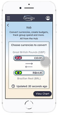
For the website version I added “The Hub” which features highlights of each tab on the app. Users can choose which currency, group, budget etc they want to carry over on the hub for quick and easy access.

Each section provides an additional means of navigation on the website with section tabs.

Final designs (hi-fi prototypes)
Like with the lo-fi versions, I connected each frame / page to create working prototypes to best represent how the final product should look and feel.

Hi-fi app prototype

Hi-fi web prototype (computer dimensions)
Hi-fi web prototype (mobile dimensions)
Accessibility considerations
Having the product follow an equity focused design was important from the start. CurrentCy's focus is to be a simple and useful tool that can benefit as many people as possible.

Both version of the product feature alt text and are compatible with screen readers.
Colours were tested using WebAIM and all pass the Web Content Accessibility Guidelines (WCAG) standards for readability.
Headings and text follow a visual hierarchy and to aid in navigation.

Going forward
-
Impact
-
What I learned
-
Next Steps
Impact

Our target users appreciated the additional functions that the product provided and noted that they would find them useful in a real world setting.
They found the design and navigation simple, visually pleasing and self-explanatory.
What I learned
This project improved my ability to empathise and get into the mind of a potential user. Combining my experiences with user research and ideation, I feel I designed a useful and unique product that I would genuinely use.
I also learned that the task of designing a product isn’t simply a start and an end, but an ongoing process of feedback and improvement.

Next steps
Iterate on the design, font and appearance of the product to improve it’s visual appeal.
Conduct tests with a wider sample of target users for additional feedback and improvement opportunities.
Further develop the community / blog aspect of the product and how users of the product can interact with each other.
Thank you for taking the time to learn about the CurrentCy app and website!
Click the link below to view my original slide deck.